Monday, 10 January 2011

Poster Analysis 3


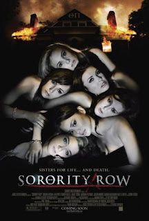
Finally, the last film poster I’ve decided to analyse is for the film ‘Sorority Row’. The image shows six girls laying on top of one another and in the background shows a sorority house which is on fire.

The girls in the poster appear to be all young and beautiful, and from their body language which shows they are laying on top of another, suggests to the audience that this film has some sexual elements to it, and already conveys that the intended target audience is going to be for mainly teenagers, who are interested in the sex appeal the film has to offer, but also recognise how they can relate to young characters in it. The characters clothing also suggests that the film has sexual elements to it as some of the girls appear to be showing their cleavage. However instead of showing a heightened sense of sexuality, their facial expressions show they are scared, which shows the audience that something sinister is going to happen in the film. Also, their body language could also have another meaning; although there are obvious sexual connotations associated with the way the laying on top of one another, it could also resemble corpses lying on top of one another, as their facial expressions also show them to be scared, but also lifeless at the same time. Thus the poster subtly foreshadows the fate of some of the girls in the film.

The sorority house behind the six girls is shown to be on fire which depicts an element of danger in the film. Fire is very symbolic of danger, as it is destructive and deadly and destroys everything in its path. Therefore by showing fire in a horror movie poster such as this, it depicts a lot about the nature of the film: filled with danger and fatal consequences for the characters. The fire burning the sorority house could also stand for betrayal, as sororities are symbolic of friendship and sisterhood, which ultimately could suggest to the audience that betrayal has taken place amongst the girls of the house.

As expected, the colours used in this poster are very dark and gloomy. Dark and gloomy colours are used to create a sinister and dark atmosphere. The 6 girls are also all wearing black clothing, which can be associated with death as it is commonly worn to funerals. This is in contrast to their glowing white skin which could convey innocence and purity. Pathetic fallacy is also used with the use of dark clouds in the background. The clouds suggest a lot about the nature of the film, that something dark and gloomy is going to occur within the film.

The title has a cross shaped blade separating the 'Sorority' with the 'Row' this may represent danger, as it could be a sign of death and the colour red can be connected with blood and fear. The title also uses white font which stands out against the black background. The title is underlined in red. The red could represent a threat or warning which is another symbol reminding the audience of the genre of the film. The ‘O’ of sorority row, is replaced with the Greek letter theta, which is a commonly used name for American sorority houses, this reminds the audience of the sisterhood related with them.
The tagline ‘Sisters for life .., and death’ is play on the pledge usually made by friends, claiming they are as close as sisters.
Poster Analysis 2


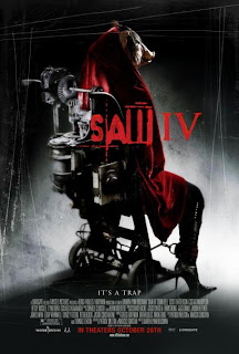
The second poster I’ve decided to analyse is for the film Saw IV. The denotation of the image is of a figure trapped in a chair attached with a highly mechanical devise. The figure is shown to be wearing stiletto shoes, implying to the viewer/passer-by that the person portrayed is a female. The stiletto shoe also has sexual connotations associated with it, which can be closely linked to the horror genre and conveys images of lust and sexual slavery. Clothing in general adds to the enigma of the film, as the person is seen to be wearing a large cloak, covering most of their body. As most of their body is covered, it may suggest to the reader that they have something to hide, adding to the mystery of the film.

The figure also appears to be tied to the chair by the ankle, implying to the viewer/passer by that the person in the chair is the victim. This image represents a feeling of imprisonment and no escape, which can be related to the horror genre, as this can further inspire a sense of torture. The person being portrayed sticks to the general, traditional concepts of the horror genre in the sense that they inspire a feeling of enigma and mystery. We cannot see the figure’s face; instead they are wearing a pig’s mask. Pigs generally have negative connotations associated with it such as being unclean. From the pigs mask it hints a lot to the viewer about the nature of the film, as it may be expected to be gory and messy, which is typical of the horror genre. As the person appears to be a victim, and they are wearing a pigs mask, it makes the viewer/passerby wonder if they are being punished for something bad they have been done, as they are being branded as pig-like, one of the dirtiest creatures in the animal kingdom.

The colours used are very typical of the horror genre. The majority of the image is very dark and shadowy, which is able to set an uneasy scary atmosphere. Dark colours generally a powerful effect on people, as being in the dark makes people fear the unknown lurking in the dark. Thus this atmosphere is perfect for a horror film, as the audience are meant to feel uneasy and scared whilst watching this film, and something simple such as a poster is able to foreshadow this through the use of dark colours. The poster also incorporates the use of the colour red, a typical convention of the horror genre. Red is the most associated colour with the genre, as it has connotations to violence and blood, a key aspect which is to be expected in a horror film.

The typeface uses a combination of different styles of lettering to enhance the effect. Part of the title appears to be written in a blood-like font, which conveys to the target audience that the film is going to be bloody, gory and filled with violence. Part of the title also uses sharp lettering, which also suggests a lot about the nature of the film as sharp objects generally have violent connotations associated with it such as knives, blood and death. Therefore this is able to foreshadow events which are going to occur in the film, and give an idea to the audience as to what is going to be expected.

There also appears to be scratches all over the poster, and this is able to suggest to the audience that there are violent elements contained within the film. However it can also give of a feeling of entrapment and somebody trying to escape, and this feeling is in sync with the line at the bottom of the poster which says, ‘It’s a Trap’, therefore these two aspects are combined together to subtly foreshadow possible events which may occur in the film.

Poster Analysis 1


The poster for ‘The Village’ sticks to the codes and conventions of a traditional horror film poster, which is essential when marketing to an audience who are cognizant of the traditional aspects of horror.

The main image on this poster is an over the shoulder image of a person looking towards a village. Aspects such as clothing and lighting are important when establishing what type of characters are being portrayed, in this case, a villain. As the shot of the person is over the shoulder, it adds to the mystery and enigma, which is typical of horror. The persons clothing adds more to the mystery, as they are wearing a hood, which hides their identity further, raising the question in the target audiences’ mind of who the person is, and why their identity is being hidden. Lighting in this case is very important in adding to the mystery, as the person is being hidden by a shadow, however we can see a slight outline of them showing they have a red coat. The lighting used here is very important, as the shadow cast on them shows they have something to hide, and possibly conveying they have a dark secret. The fact that the only things clear enough to see on this person is a red coat emphasizes how this person is suggested to be a sinister character, as the colour red denotes an image of blood, death and violence, all typical conventions of the horror genre.

Overall the colours used in the film poster are very dark and bleak. Dark colours are very typical of horror films as they denote an image of something sinister and evil, which are typical aspects to expect in the horror genre. Therefore the colour black is used extensively in this poster as it creates a perfect atmosphere which conveys the horror genre. Also the colour surrounding the village is an almost fiery yellow. Fire generally denotes an image of danger, which is a key theme which can be tied into the horror genre, and the audience will suspect the characters to be in some form of danger. Fire can also be linked with hell and evil, which could reflect the villain in the film: an evil, devilish individual.

The typeface used a key aspect of this poster which is able to represent the horror genre successfully. The lettering is conventional of the genre as it is somewhat distorted. The typeface is distorted as there the flame like colour spills over the edges of letters, which conveys an effect of the title being on fire. The designer of the poster was well aware that the typeface would have to reflect certain aspects of the film, as it shows that the village in the film may be a dangerous and sinister place, as the title appears to be as if it’s on fire. Although there are features of the typeface which are distorted and make is seem on fire, other parts of it appear have very sharp lettering. Sharp lettering is an appropriate style of writing to use on a horror poster, as sharp objects generally represent danger, violence and knives, which are key aspects to expect in a horror film. Also, there appears to be a small scratch in the typeface, which suggests a lot about the nature of the film. The scratch signifies violence and barbaric behavior, elements which are to be expected in a horror film.

Mise en scene must be taken into consideration when analyzing the horror aspects of this poster. The image shows tree branches distorting the image of the village, and this was used cleverly by the designer of the poster to convey a feeling of danger. The tree branches shown are all long and sharp, and it can be argued that these can resemble a long sharp sword, which has connotations associated with it such as violence, death and blood, which are all feelings in harmony with the horror genre.

The writing at the top of the image creates a scary and sinster atmosphere through the use of particular word choices. There is constant referral to ‘them’ which adds enigma and mystery amongst the target audience, as it raises the question in one’s mind as to who ‘they’ are. The mystery and built through word choices is effective as it creates the appropriate atmosphere for the horror genre.

Magazine Analysis 3

Magazine Analysis 2

Magazine Analysis 1

Wednesday, 5 January 2011

Introduction to Magzine and Poster Production

The second part of our coursework consists of the group individually making a film poster and magazine front cover in relation to our films we've produced. In order for both of these pieces of work to be produced in the highest possible standard, I've undergone market research and identified the codes and conventions of both film magazines and film posters. I felt that this market research would be both essential and beneficial towards the production of my magazine cover and poster, as i'd be able identify the typical conventions used in todays market and apply them to my products. In order to keep a sense of originality to my products, i've taken my own pictures, thus ruling out issues such as copyright. The software I'm going to use to manipulate my images is Photoshop CS5, so that my finished product can be of the highest possible standard.