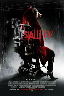
The second poster I’ve decided to analyse is for the film Saw IV. The denotation of the image is of a figure trapped in a chair attached with a highly mechanical devise. The figure is shown to be wearing stiletto shoes, implying to the viewer/passer-by that the person portrayed is a female. The stiletto shoe also has sexual connotations associated with it, which can be closely linked to the horror genre and conveys images of lust and sexual slavery. Clothing in general adds to the enigma of the film, as the person is seen to be wearing a large cloak, covering most of their body. As most of their body is covered, it may suggest to the reader that they have something to hide, adding to the mystery of the film.
The figure also appears to be tied to the chair by the ankle, implying to the viewer/passer by that the person in the chair is the victim. This image represents a feeling of imprisonment and no escape, which can be related to the horror genre, as this can further inspire a sense of torture. The person being portrayed sticks to the general, traditional concepts of the horror genre in the sense that they inspire a feeling of enigma and mystery. We cannot see the figure’s face; instead they are wearing a pig’s mask. Pigs generally have negative connotations associated with it such as being unclean. From the pigs mask it hints a lot to the viewer about the nature of the film, as it may be expected to be gory and messy, which is typical of the horror genre. As the person appears to be a victim, and they are wearing a pigs mask, it makes the viewer/passerby wonder if they are being punished for something bad they have been done, as they are being branded as pig-like, one of the dirtiest creatures in the animal kingdom.
The colours used are very typical of the horror genre. The majority of the image is very dark and shadowy, which is able to set an uneasy scary atmosphere. Dark colours generally a powerful effect on people, as being in the dark makes people fear the unknown lurking in the dark. Thus this atmosphere is perfect for a horror film, as the audience are meant to feel uneasy and scared whilst watching this film, and something simple such as a poster is able to foreshadow this through the use of dark colours. The poster also incorporates the use of the colour red, a typical convention of the horror genre. Red is the most associated colour with the genre, as it has connotations to violence and blood, a key aspect which is to be expected in a horror film.
The typeface uses a combination of different styles of lettering to enhance the effect. Part of the title appears to be written in a blood-like font, which conveys to the target audience that the film is going to be bloody, gory and filled with violence. Part of the title also uses sharp lettering, which also suggests a lot about the nature of the film as sharp objects generally have violent connotations associated with it such as knives, blood and death. Therefore this is able to foreshadow events which are going to occur in the film, and give an idea to the audience as to what is going to be expected.
There also appears to be scratches all over the poster, and this is able to suggest to the audience that there are violent elements contained within the film. However it can also give of a feeling of entrapment and somebody trying to escape, and this feeling is in sync with the line at the bottom of the poster which says, ‘It’s a Trap’, therefore these two aspects are combined together to subtly foreshadow possible events which may occur in the film.
No comments:
Post a Comment